Qualticom
- Logo Design
- Branding
- Digital Startegy
- UX/UI
- Front & Backend Dev
- Logo
- Website
- App
- Divyang Patel
Qualticom is a comprehensive supply chain solutions provider company that is known for its impeccable electronic design & manufacturing services. Our tasks included proper execution of product lifecycle activities through minimalist design and uncluttered narrative.
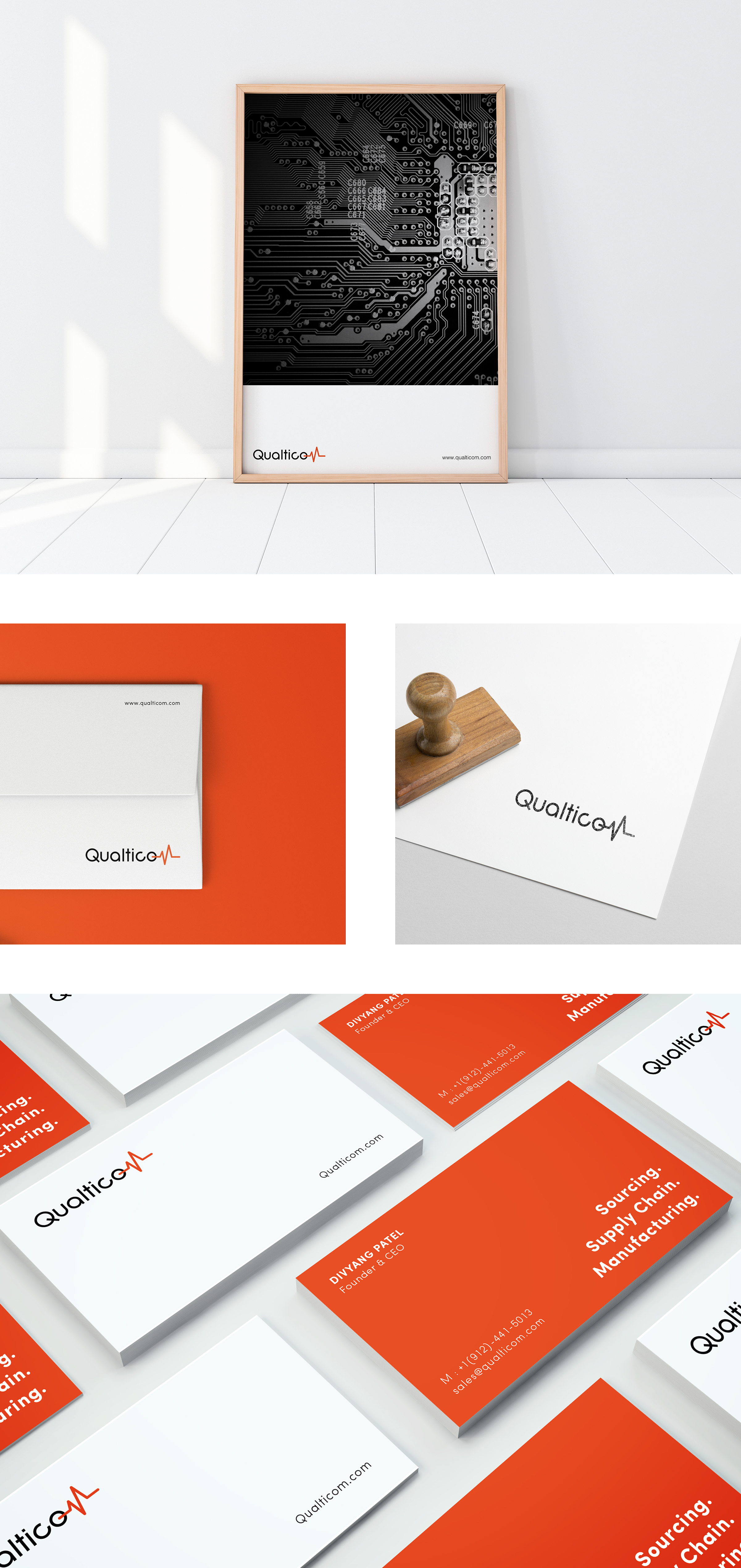
Branding
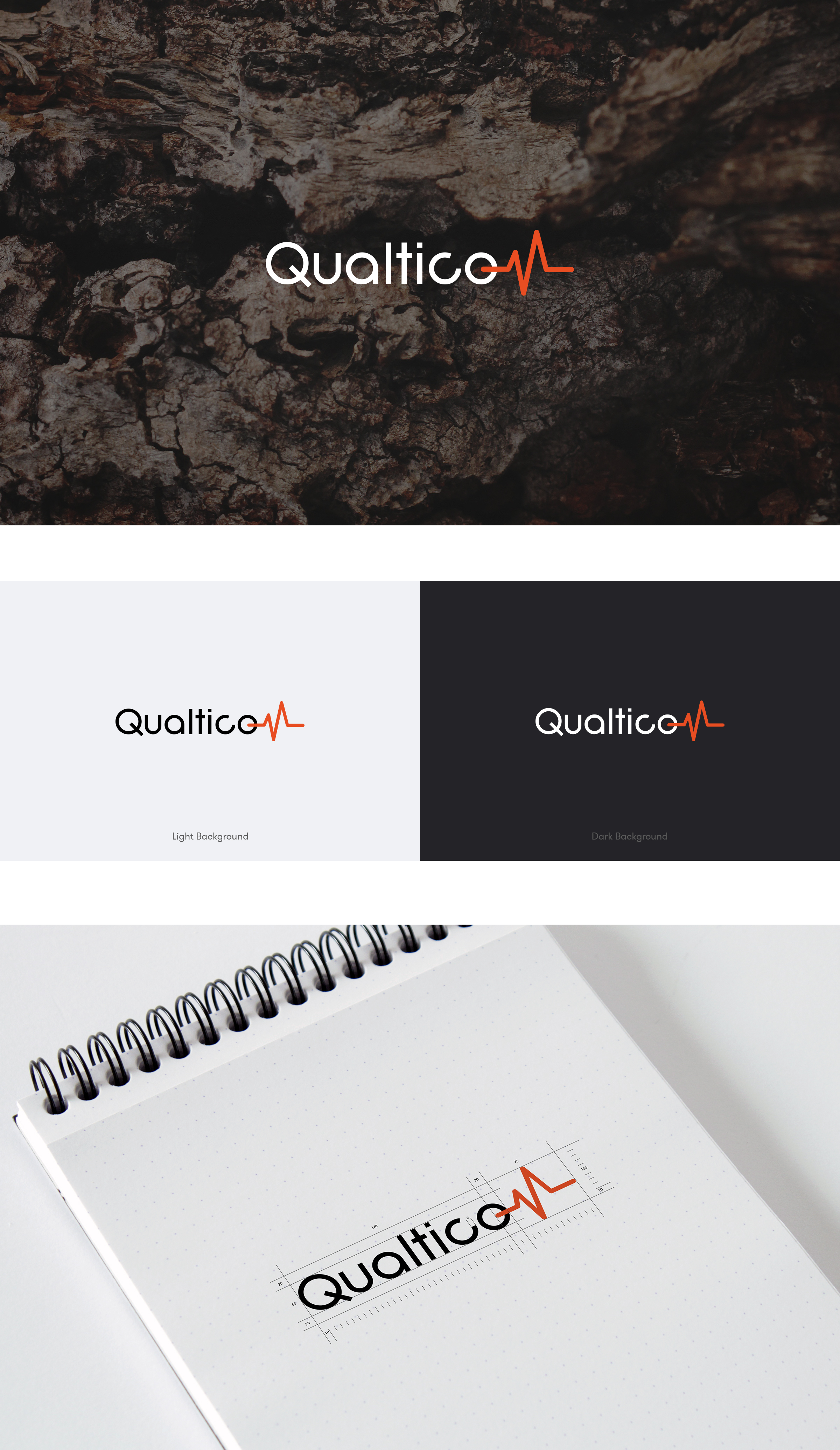
We revamped the brand with a typography that matched the domain – electronic circuits! We endeavored to pitch several ideas on the logo that touched upon electrical flow, on circuitous pathways, and on “Q” itself!

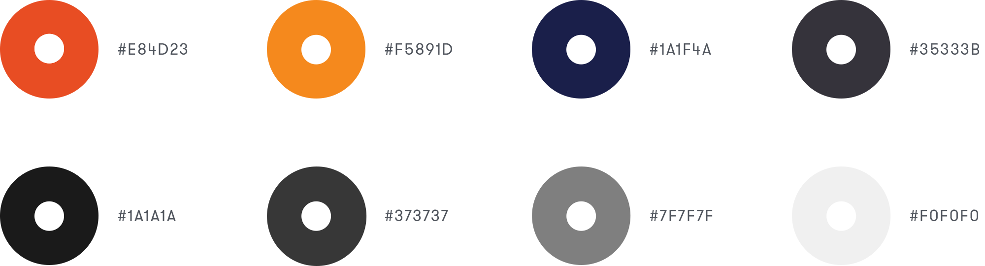
Brand Colours
Qualticom relies on the mix of white and orange for its primary impression with a shade card that includes a lot of the grey palette.
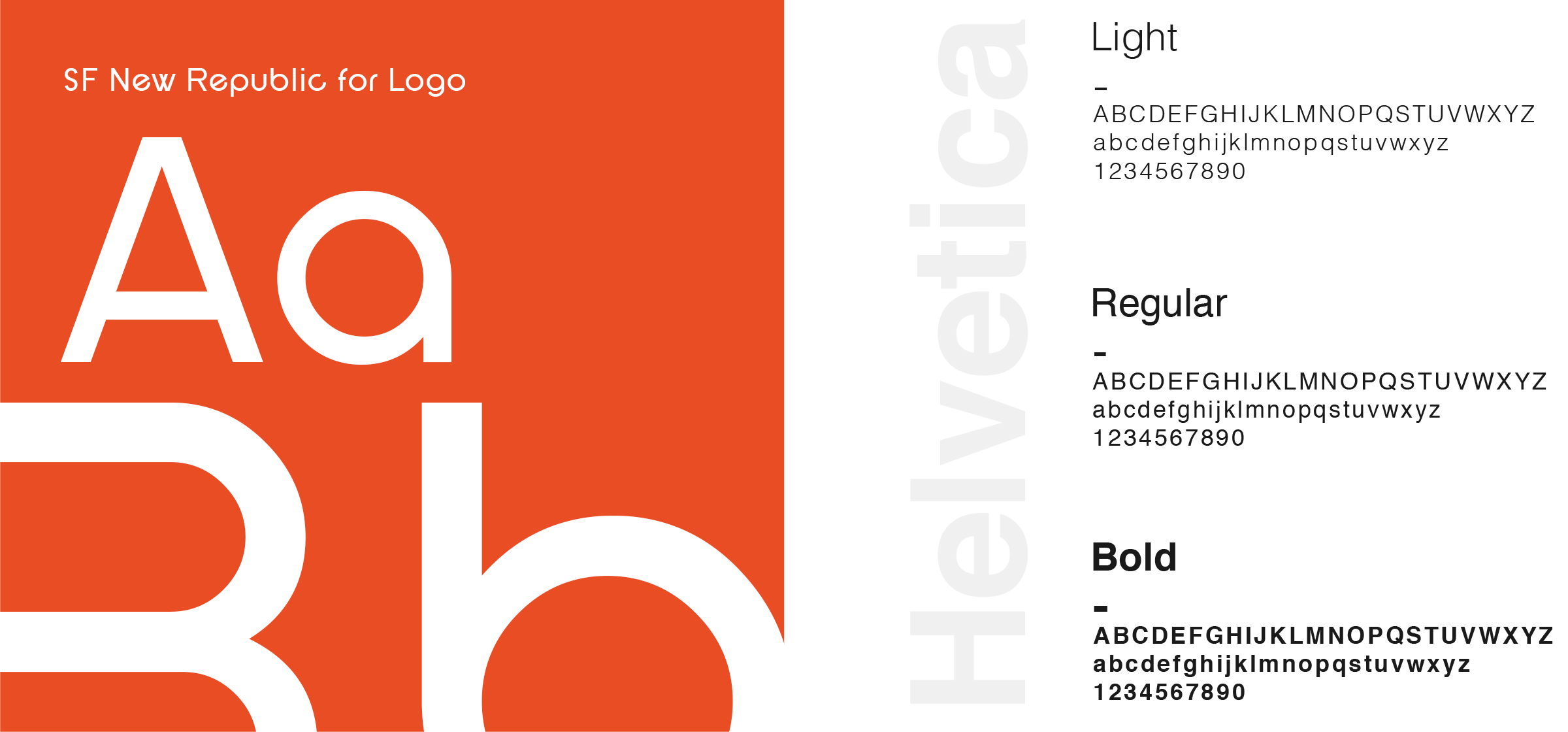
Typography
By focusing on its name that indicated quality in its offerings, we introduced a font -SF New Republic to showcase it and then let the last letter M indicate flow, just like a heartbeat on the monitor. The play of white/ black color of the main letters and an orange rendition of heartbeat for M on different backgrounds reinvented what the brand meant in purposeful manner.
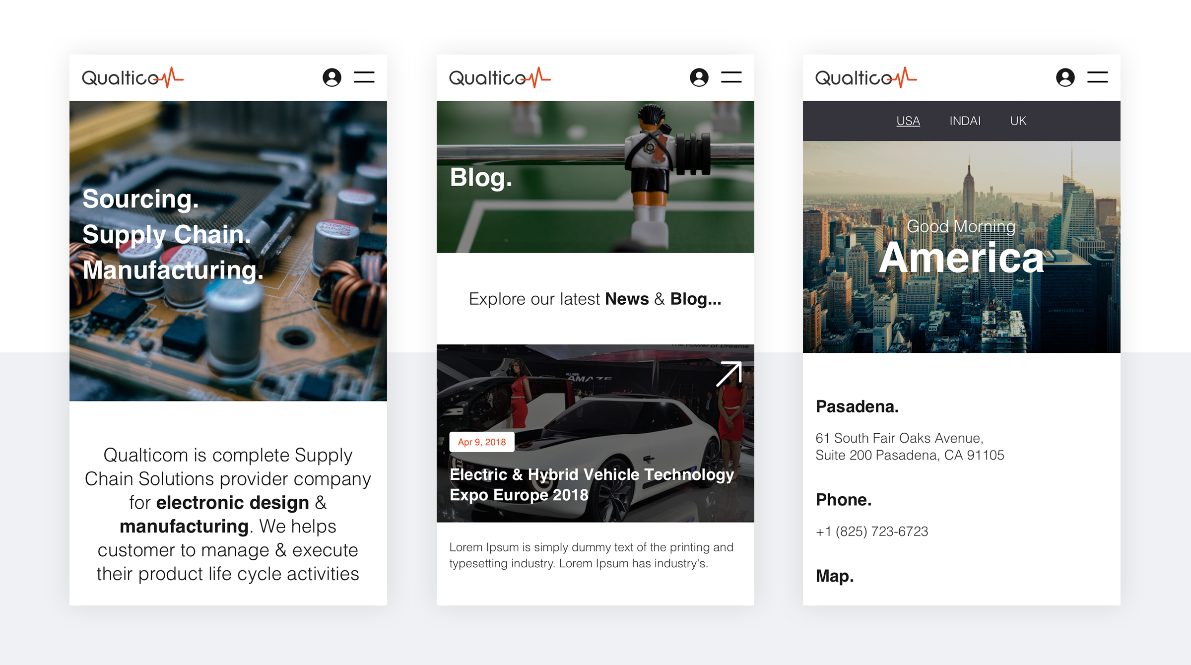
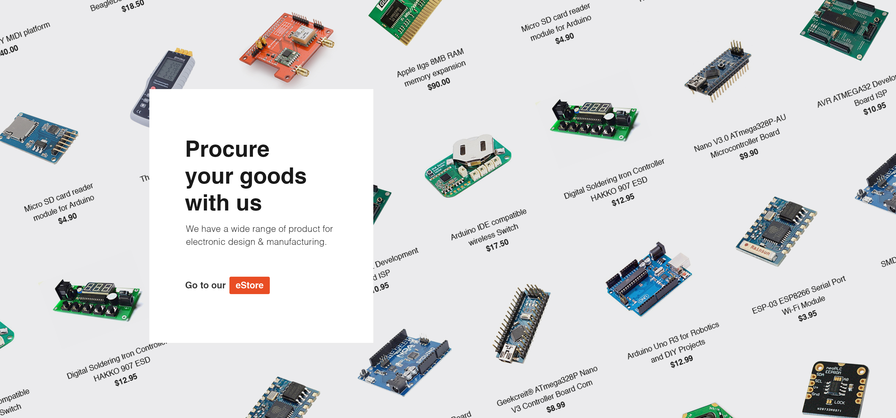
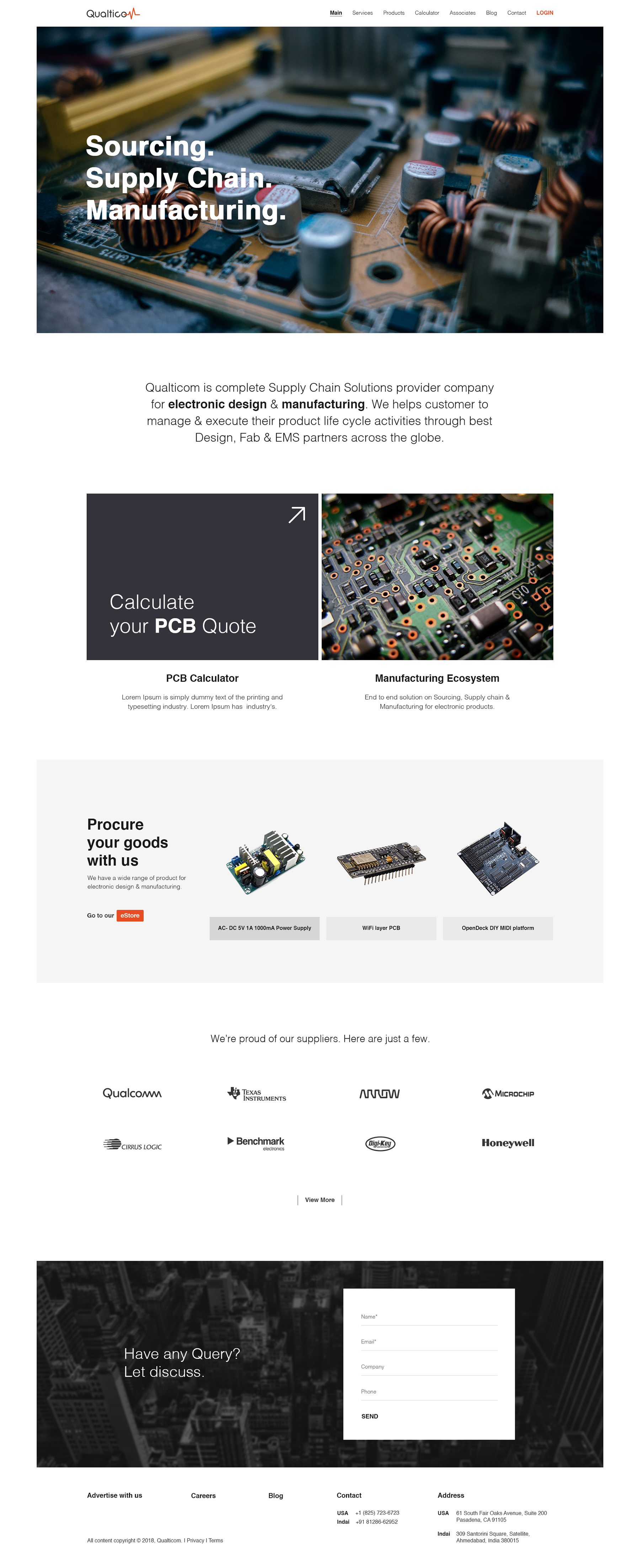
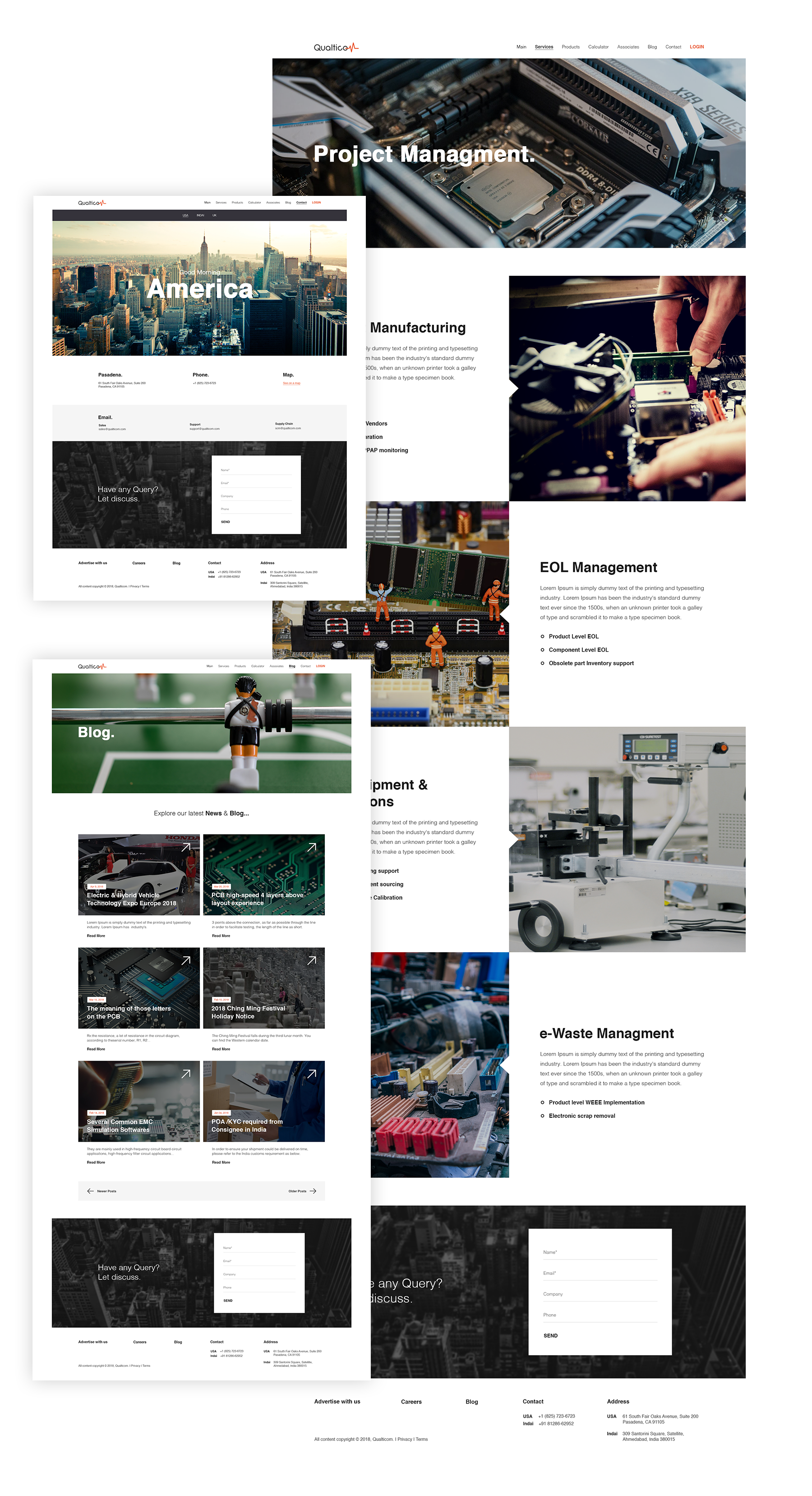
Website
The web design for the brand includes more stress on real imagery than text that is precise and to the point. The call to action and the links to purchase of different electronic boards underline direct contact and pitch with website visitors, especially prospects.
Responsive
We have tried to match our deadline but our expert content writer still working on it :( Original text will be live soon.